![]() The truth in its opposition to The Blues, is Orange. A happy color, grotesque if engaged in high concentrations, used in flowers and soups and silly dresses. Orange is
The truth in its opposition to The Blues, is Orange. A happy color, grotesque if engaged in high concentrations, used in flowers and soups and silly dresses. Orange is
not used on walls or dignified as primary house paint; o, no. It is acceptable even in sunsets, where gaudy pinks are distastefully preferred. It is lauded on the drunken beach parties and even applauded occasionally.
Orange: the Courageous One; unquarantainable at heart. Bringing it up in polite society is a shocking lack of decorum. Even disguised as burnt Siena or intentionally blended out to Coral with white and weak yellow will be caught in the sunlight and expelled. Watch for the storyboards, upcoming in several weeks.
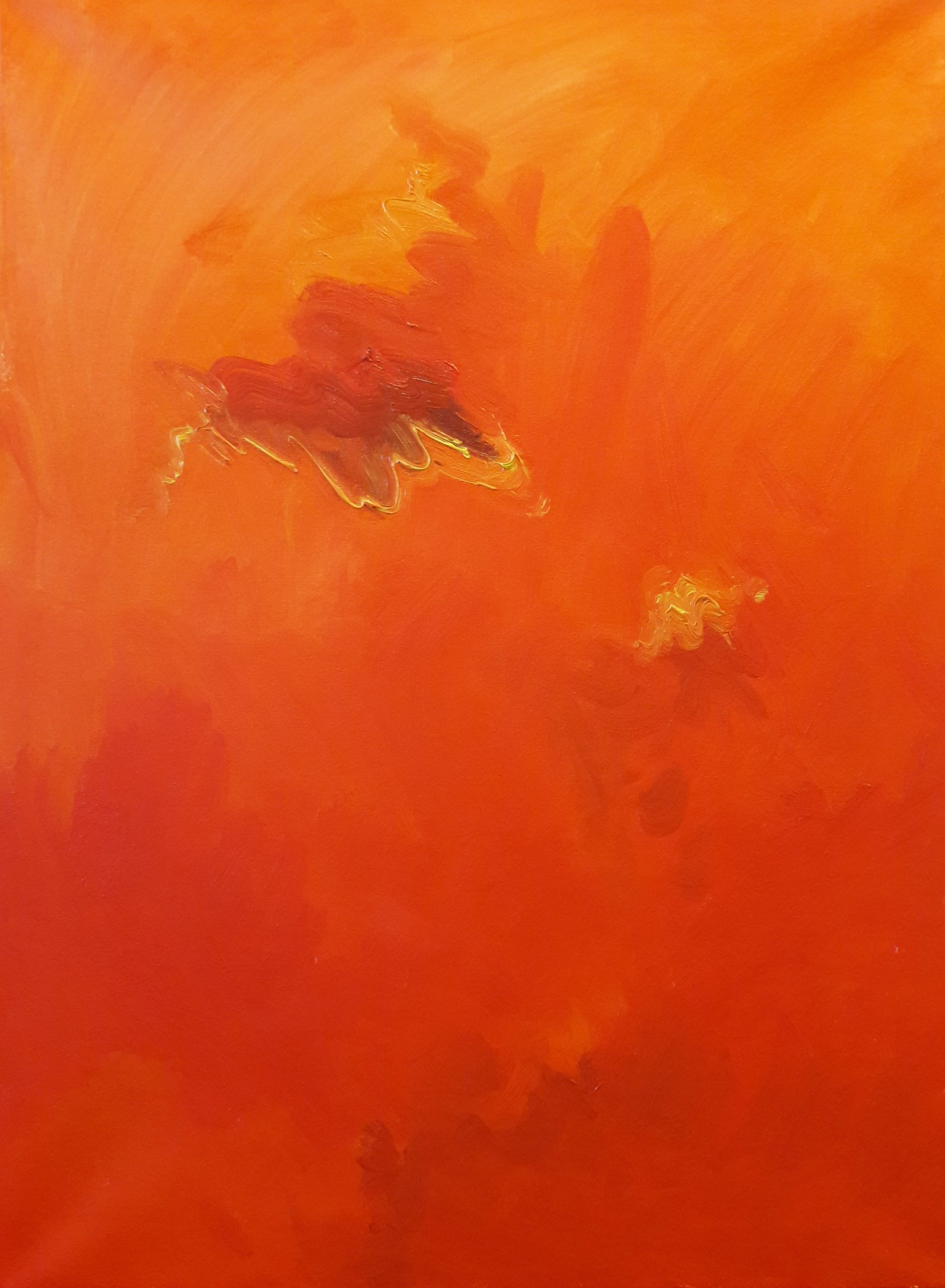
Please note the Inititation piece.
Nonetheless, the Covid Blues 19 are oversaturated in blues. French ultramarine, Cobalt, teal, turquoise, Prussian Blue, peacock,…but I digress. Please note here for the first time:
Covid Orange 19!